I’ve used a Mac my entire life, and it’s certainly no secret that I have a special affinity for Apple. But it’s important to keep an eye on the competition. All of these operating systems push each other forward. They keep each other on their toes. So when Microsoft unveiled Windows 11 with a specific emphasis on its refined design, I had to try it out. Here’s what I think after using it for a few hours.
I’m testing Windows 11 on a 2017 Surface Pro. It technically doesn’t meet Microsoft’s minimum requirements for the update, but the company is letting even unsupported machines run the developer preview. The company says it’s doing this to evaluate what other machines might be able to run Windows 11. It looks like they might change the minimum requirements by the time the operating system is complete for release later this year. The specs on my Surface Pro are pretty mediocre, it has an Intel Core m3 at 1.6GHz, 4GB of RAM, and 128GB of storage. It’s no speed demon, but it ran Windows 10 just fine and shows no signs of slowdown with Windows 11.
A new design language
Windows has never looked “beautiful.” It’s always been a mashup of different eras going back to the ’90s with some paint on the surface. Windows 10 did a nice job of covering up some of the mess and it made the OS more usable. But Windows 11’s biggest feature by far is its new design language that extends across the system.
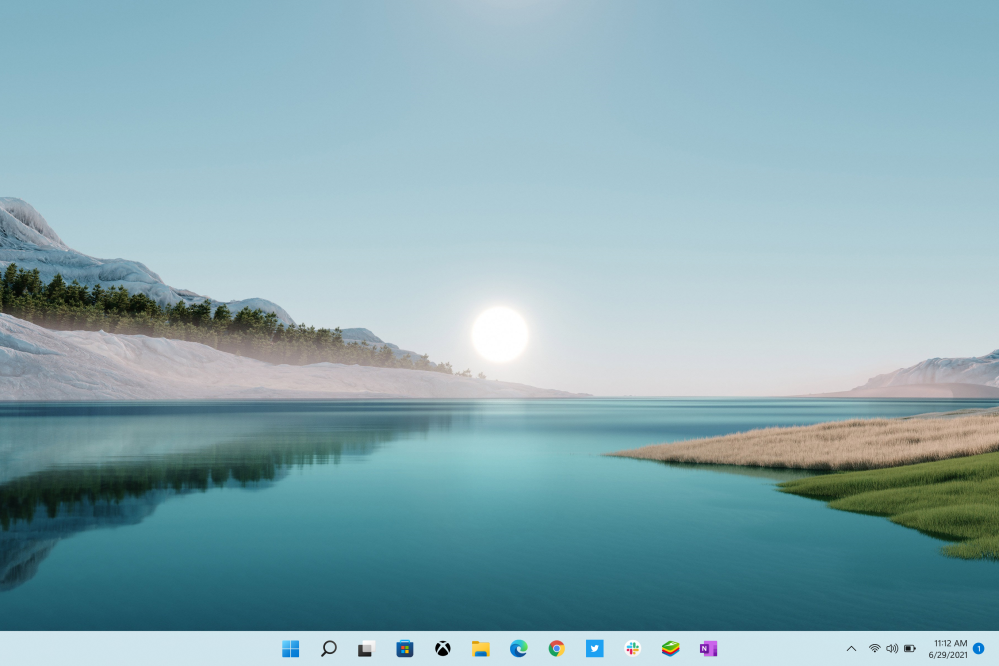
It’s still familiar and recognizable as Windows, but it feels like they really care about the way this operating system looks and feels in a way they haven’t before. The company has implemented a fresh new look for the task bar and the start menu. Icons have fun new playful animations, and many also have a new look with more personality and depth. The default wallpapers included in Windows 11 complement the new taskbar really nicely as well. The Verge has all of them available for download if you want to use them on your devices.
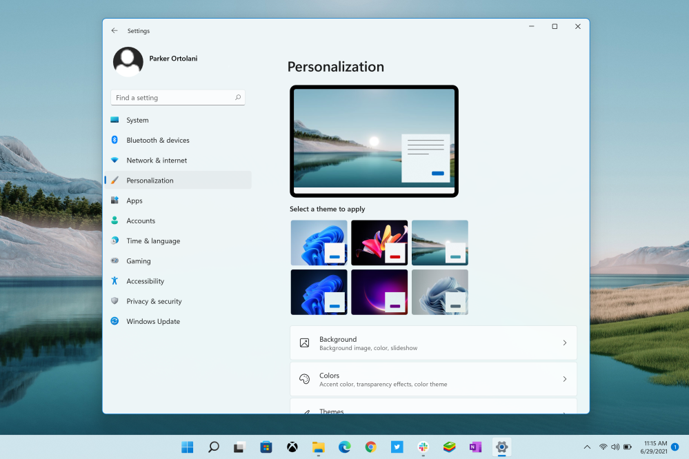
Microsoft has included a powerful new theming system that combines specific wallpapers with colors and styles that go nicely together. The new design is almost entirely customizable in a way that macOS isn’t.
The new start menu and task bar
I’ve never liked the Start menu. It always felt kind of lousy and cheap to me. The macOS dock has always been great and I still prefer it. But the new taskbar has a centered design that more closely resembles macOS’s dock. The new Start menu itself is also very different from previous iterations. It’s smarter and has recommended files and apps as well as a section for your favorite apps to be pinned. It ditches smart tiles entirely so it’s less dynamic, but that actually seems to work in its favor.
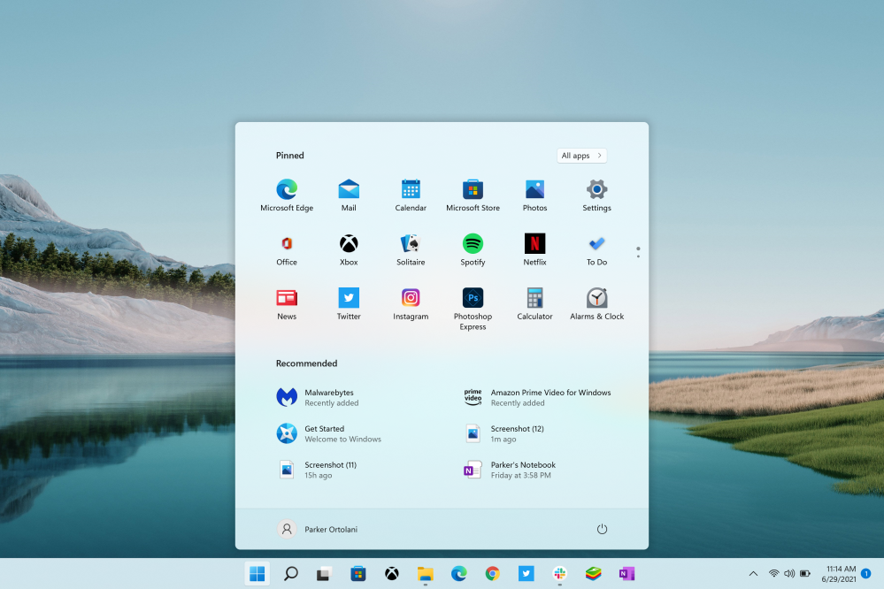
It’s centered like the new taskbar icons and feels more like the Chrome OS launcher than the Windows 10 Start menu. It’t just so much simpler and so much better. Search is also centered and has a similar look to the Start menu. It feels faster, too.
Rounded corners
Another new feature of the design is rounded corners across the system. Like macOS has had since 2000, Windows now has windows with rounded corners. They’re not as smooth as the ones in macOS, but they make the OS feel more natural and less harsh. Combined with the new animations on app icons, trays, and more it makes for a really pleasant experience. It doesn’t feel like a chore to use Windows 11 the way it did in the past with previous versions.
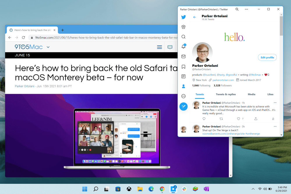
Existing apps also receive the new rounded corners so everything feels up to date in the Windows 11 environment. They’ve also updated the control tray and notification design that pops out from the right slide of the taskbar. It complements the new widget tray that slides out of the left side. I haven’t found it particularly useful, though, it’s nowhere near as powerful as macOS’s widgets in Big Sur.
Cleaner file explorer
One of the things I’ve always hated about Windows is the file explorer. It has never lived up to the macOS Finder, and it still doesn’t. It does, however, receive a major improvement in Windows 11 that makes it look cleaner and feel easier to use. But at its heart, it’s still the same Windows file explorer.
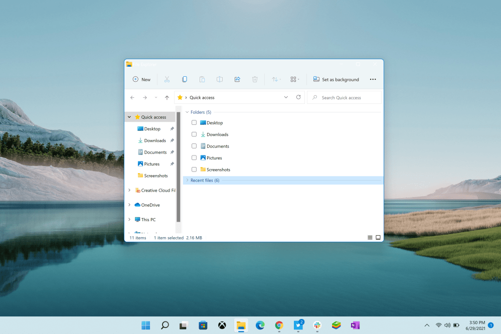
They’ve replaced the ugly ribbon that’s lived in the toolbar for ages with a series of shortcut buttons for things like cut, copy, and paste, as well as options for sharing and layout. Overall, it just looks and feels better. But Microsoft still has a long way to go before they get on the same level as Finder. I think they should start from scratch and build an entirely new file explorer app for the future.
What could Apple learn?
I’d like to say nothing, but there are a few things in Windows 11 that Apple should think about. The biggest one is personalization. Apple has been in the habit of stripping away customization options on macOS over the past several years. I’d love to see them bring back the ability to easily change app icons, set themes, and customize colors. Right now the system is pretty limited to dark mode or light mode, a system color, and a wallpaper.

Another thing I’d love to see is more playfulness in macOS. macOS is bright, bubbly, and colorful and it should have animations that reflect that. Windows 11 has lots of delightfully unexpected animations, for example, when you click on icons in the taskbar.

Lastly, let’s talk about the Start menu. I don’t want a Start menu on the Mac. But I would like for Apple to finally update Launchpad. I’d love to see Apple take the new App Library design from iPadOS 15 and bring it to macOS in the future. I’d also love for it not to take up the entire screen, covering my windows and content.
Conclusion
Windows 11 is a substantial update to a platform that has become increasingly important because of the pandemic. It includes quality of life improvements to apps, a fresh new design, and features like the ability to run Android software. It’s a worthy competitor to macOS Monterey and I’m curious to see how the two operating systems evolve while they’re in beta through the rest of the summer.
If you want to try Windows 11 on your PC, you can do so by joining the Windows Insider Program in the settings app. Make sure to set your update channel to “dev.” Then you’ll see the Windows 11 preview show up in software update.
What do you think about Windows 11’s new design? Do you think it’s a worthy competitor to macOS Monterey? What features in Windows 11 might you want to see in macOS? Let us know in the comments below!
Check out 9to5Mac on YouTube for more Apple news:
Windows 11 hands-on: A Mac user’s perspective on the new design and what Apple could learn - 9to5Mac
Read More
No comments:
Post a Comment