iPadOS 15 is arriving at a crucial time for the iPad. Ever since the well-designed and overly powerful 2018 iPad Pro arrived, people have increasingly asked Apple to make its tablet software as flexible and impressive as its hardware. This year’s iPadOS update isn’t going to satisfy those who want the iPad to work more like a Mac — it still feels like an iPad, for better or worse.
That said, Apple has made a handful of significant changes and a host of smaller ones, all of which add up to an experience that makes the iPad more customizable and flexible than before while still retaining (and improving upon) the basic iPad experience. There are a lot of new features to unpack, and the just-released iPadOS 15 public beta is still a work in progress, but here are some of the most significant changes to look forward to when the final software arrives this fall.
Should you install iPadOS 15?
But first, a note about that beta status. Apple’s public betas are generally pretty reliable, and that’s true here, too. I’ve generally been able to use my 11-inch iPad Pro without any issues, but apps occasionally crash and throw me to the Home Screen; interacting with notifications doesn’t always work; and there are various other hiccups here and there. (Examples: my cursor doesn’t always move to the search field when I summon it, and the last few letters of my messages are sometimes cut off when using the app in Slide Over.) It’s nothing deal-breaking, but it’s noticeable, particularly when I use my iPad for multiple hours at a time. Unless you're extremely curious, I'd wait for a few more beta versions to be released before giving it a shot, unless you can put it on a back-up iPad.
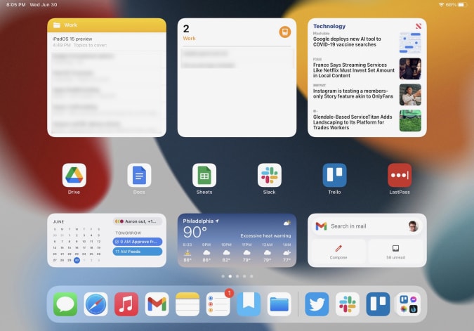
With that out of the way, let’s dig into the new features. The most obvious change in iPadOS 15 is that widgets have come to the Home Screen. As with last year’s iOS 14, iPad users can now pin widgets anywhere they want. You can also select which apps you want to show on the Home Screen and stash the rest in the App Library, an auto-organized place to find everything you’ve installed on your iPad. Both widgets and the App Library came to the iPhone last year, and it was surprising that they didn’t arrive on the iPad until now.

I’m glad Apple did this, because it makes your iPad’s home screens far more customizable than before, something sorely needed on a big-screen device. It took a little work, but I’ve now hidden the apps I don’t use as much in the App Library and now have five home screens curated for work, entertainment, games and so forth. For example, my work screen only has six app shortcuts (Drive, Docs, Sheet, Trello, Slack and LastPass), but the variety of widgets I have installed provides glanceable info and easy access to a lot of tools. I have a widget showing recent notes in the “work” folder, another with Reminders (also specifically from my work group), an Apple News widget showing the latest tech news, and widgets for Google Calendar and Gmail. All that, plus the apps in my dock, make this the prime place to go when I need to get things done.
Quick Notes
The other new feature that could fundamentally change the iPad experience is Quick Notes. As Apple’s Craig Federighi said during last month's WWDC keynote, Notes are now a “system-wide” feature. Swiping in from the lower right corner summons a new note that floats above whatever apps you’re using. You can quickly type or write down (with the Apple Pencil) whatever comes to mind and then swipe the note away when you’re done. Depending on your settings, you can start a new note every time you access Quick Notes, or just keep adding to the same one. Finally, you can swipe between Quick Notes you’ve started if you want to get to a specific document.

The iPad’s Slide Over multitasking feature offered an approximation of this experience, but Quick Notes is far more flexible. For starters, you can move a Quick Note anywhere on the screen you want, making it feel like a true “window” reminiscent of something you would use on Windows or macOS. If you’re going to jump in and out of the same note frequently, you can dismiss it to the side of the iPad screen where a little arrow shows that you can summon it back quickly.
Apple’s Quick Note demos mostly focused on using the Apple Pencil to quickly jot things down, but it works just as well with a keyboard. When I’m doing work, it’s almost always with the Magic Keyboard attached, and being able to quickly summon a persistent document to take notes in, regardless of what else I was doing, makes the iPad feel significantly more versatile. It’s a great tool when doing research, especially since you can add links to web pages in Safari or destinations in Maps with one tap. My only real complaint is that the “swipe in from the bottom right” gesture is a little awkward, especially when using the iPad docked to a keyboard. It’s much with the Apple Pencil.
Multitasking
Multitasking was a major focus at WWDC, as well. While Apple did make some useful changes here, the fundamental iPad multitasking experience is still the same. Apps can take up the whole screen, or share the display with a second app in Split View. There’s also the Slide Over area, which lets you quickly summon a floating window containing another app. Apple has made major improvements to these features over the years, but they’re the same fundamental multitasking options we’ve had since iOS 9 back in 2015.

If you’ve been hoping for a true windowed multitasking experience, this isn’t it. But Apple has made it easier to work with the multitasking features it does offer. Now, there’s a tiny three-dot menu at the top of every app you use that lets you move the app between full screen, slide over and split view. As I compose this sentence, I’m typing in the Notes app, full screen. If I want to take Notes into Split View and share the screen with Safari, I just tap the multitasking menu and hit the Split View icon. This gives me a full view of my Home Screen, which then lets me pick anything I want to go alongside Notes.
Being able to quickly choose from any app on your Home Screen when setting up a multitasking view is a big improvement; before, you primarily had to use search to find the app you want, or drag one of the apps available in your dock. The menu also makes it a lot easier to move apps between Split View, Slide Over and full-screen views. Previously, you had to be aware of a variety of gestures, but a few minutes of playing with the multitasking menu makes the behavior pretty clear.
Safari
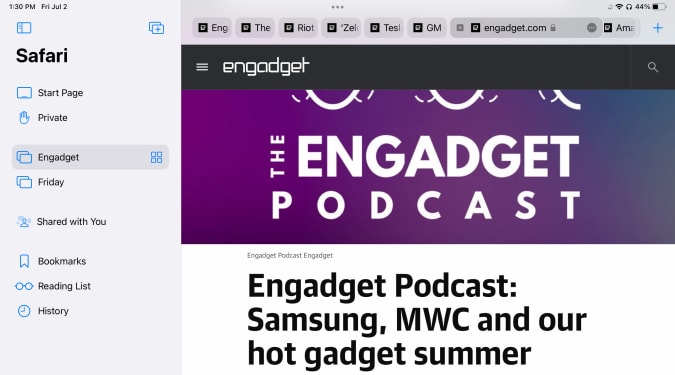
The last major change I’ll cover at this early stage is Safari. It’s one of the most important apps on the iPad, and it’s gotten a lot better in the last few years. But for iPadOS 15, Apple has made what I predict will be a polarizing design decision. In an effort to slim down the top menu bar, Apple crammed the URL bar and open tabs into one row. Essentially, a tab and its URL bar are now represented by a single visual cue.
This means that the location of the URL bar moves. If you’re looking at the right-most tab you have open, for instance, the URL bar is all the way to the right. It definitely takes some time to get used to, since most of us are used to it always being right in the center of whatever browser we’re using. This also makes it harder to see all your tabs; besides the “active” tab, I can currently see eight others. The rest are hidden off to the left and right of my active tab. To see them, you’ll have to scroll either direction to find what you’re looking for.


Apple’s menu bar cleanup also means it removed the button that zooms out to show you a preview of every tab you have open. I used that constantly, so I hate this change. And unlike on the Mac, you can’t customize the Safari menu on the iPad at all. Now, you either have to use a keyboard shortcut or pull up the new sidebar, which contains all the open tabs in a window along with your bookmarks, reading list, history and links shared in Messages.
Safari on the iPad already did a great job of hiding the menu bar once you started scrolling through a site, so this change feels unnecessary to me. I’ll be curious to see what kind of feedback Apple gets during the beta, because I wager plenty of other people will prefer the old layout.

There is at least one good thing about the new Safari: tab groups. They’re handled elegantly, with a button in the sidebar letting you open either a new “blank” group for you to populate or taking all your current tabs and saving them as a group. You can swap between groups in the sidebar, and access any groups you’ve created in any open Safari window you have. Groups will also sync across your other devices, assuming you’ve upgraded to iOS 15 or macOS Monterey. Having different tab groups for different tasks has already proven useful to me, and I’ll probably use them even more as I get used to incorporating them into my workflow.
More to come
There are plenty of other significant changes to iPadOS 15, things like the new Focus system and notifications revamp, improvements to FaceTime and Messages, the new Universal Control system that works between a Mac, iPhone andiPad, and plenty more. (You can read about some of these changes in our previews of iOS 15 and macOS Monterey.) We’ll be doing a proper review of all the new software in its final form this fall, but in the meantime I’m going to keep digging into the future beta releases to see how iPadOS 15 changes between now and its wider release.
All products recommended by Engadget are selected by our editorial team, independent of our parent company. Some of our stories include affiliate links. If you buy something through one of these links, we may earn an affiliate commission.
iPadOS 15 beta preview: Widgets and Quick Notes make for a new experience - Engadget
Read More

No comments:
Post a Comment