
I am not a data scientist. And while I know my way around a Jupyter notebook and have written a good amount of Python code, I do not profess to be anything close to a machine learning expert. So when I performed the first part of our no-code/low-code machine learning experiment and got better than a 90 percent accuracy rate on a model, I suspected I had done something wrong.
If you haven't been following along thus far, here's a quick review before I direct you back to the first two articles in this series. To see how much machine learning tools for the rest of us had advanced—and to redeem myself for the unwinnable task I had been assigned with machine learning last year—I took a well-worn heart attack data set from an archive at the University of California-Irvine and tried to outperform data science students' results using the "easy button" of Amazon Web Services' low-code and no-code tools.
The whole point of this experiment was to see:
- Whether a relative novice could use these tools effectively and accurately
- Whether the tools were more cost-effective than finding someone who knew what the heck they were doing and handing it off to them
(For those who have not read the previous two articles, now is the time to catch up: Here's part one, and here's part two.)
Assessing the robot’s work
Canvas allowed me to export a sharable link that opened the model I created with my full build from the 590-plus rows of patient data from the Cleveland Clinic and the Hungarian Institute of Cardiology. That link gave me a little more insight into what went on inside Canvas' very black box with Studio, a Jupyter-based platform for doing data science and machine learning experiments.
As its name slyly suggests, Jupyter is based on Python. It is a web-based interface to a container environment that allows you to spin up kernels based on different Python implementations, depending on the task.
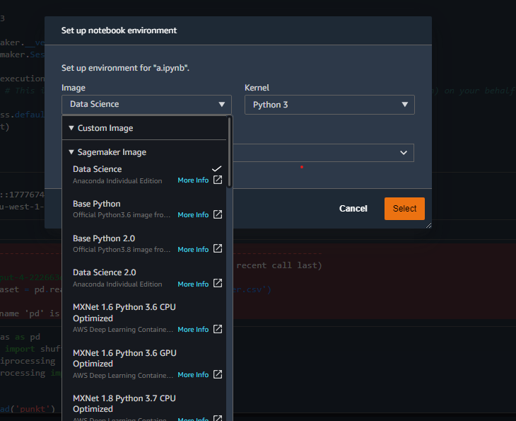
Kernels can be populated with whatever modules the project requires when you're doing code-focused explorations, such as the Python Data Analysis Library (pandas) and SciKit-Learn (sklearn). I used a local version of Jupyter Lab to do most of my initial data analysis to save on AWS compute time.
The Studio environment created with the Canvas link included some pre-built content providing insight into the model Canvas produced—some of which I discussed briefly in the last article:
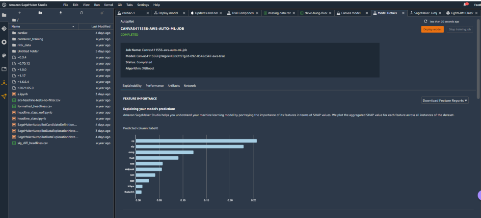
Some of the details included the hyperparameters used by the best-tuned version of the model created by Canvas:
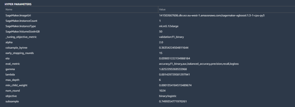
Hyperparameters are tweaks that AutoML made to calculations by the algorithm to improve the accuracy, as well as some basic housekeeping—the SageMaker instance parameters, the tuning metric ("F1," which we'll discuss in a moment), and other inputs. These are all pretty standard for a binary classification like ours.
The model overview in Studio provided some basic information about the model produced by Canvas, including the algorithm used (XGBoost) and the relative importance of each of the columns rated with something called SHAP values. SHAP is a really horrible acronym that stands for "SHapley Additive exPlanations," which is a game theory-based method of extracting each data feature's contribution to a change in the model output. It turns out that "maximum heart rate achieved" had negligible impact on the model, while thalassemia ("thall") and angiogram results ("caa")—data points we had significant missing data for—had more impact than I wanted them to. I couldn't just drop them, apparently. So I downloaded a performance report for the model to get more detailed information on how the model held up:
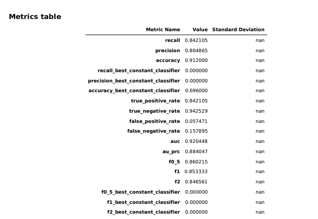
In the statistics from the Canvas model for our data set, we see that it had a much better rate of picking true negatives (not a heart attack) than true positives (definitely a heart attack)—94 percent versus 86 percent. There are a few other figures that are of importance here statistically: the precision of the model, the recall of the model, and the model's F1 score.
- Precision: The total number of true positives (the number of times it guessed "heart attack" correctly) divided by the total number of positives (all the "heart attack" guesses, both correct and incorrect).
- Recall: The total number of true positives (correct heart attack guesses) divided by the total number that should have been positives.
- The F1 score is a measurement used for balanced accuracy. It is the harmonic mean of precision and recall, rating the model on how well it performs in finding the desired category overall. It is calculated by multiplying together Precision and Recall, dividing them by the sum of Precision and Recall, and multiplying by two. (As in
F1 = 2 * ((Precision * Recall) / (Precision + Recall))).
The Canvas model's precision was 0.86—meaning that when it categorized a patient as one who would have a heart attack, it was right 86 percent of the time. And its recall—the rate at which it correctly categorized patients as having a heart attack—was 0.84. The F1 value (0.85) represents the balanced accuracy of the model.
Another way of looking at the performance of the model is what's called the "confusion matrix"—a box showing the distribution of correct and incorrect categorizations:
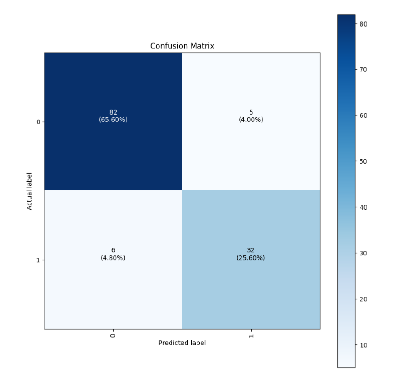
You can see that 59 times—9.88 percent of the time—the model saw actual heart attack cases and classified them as "not heart attack."
When you're trying to forecast something as serious as a heart attack, you want the false negative value to be as low as possible (and the F1 value to be as high as possible). So I wanted to see if I could squeeze any better performance out of the data I had using my limited data science skills.
I could not.
Here comes Data Wrangler
In an attempt to make things better, I started by using SageMaker's Data Wrangler to do something about my questionable data quality. I opened a new Launcher tab in Studio and got started:
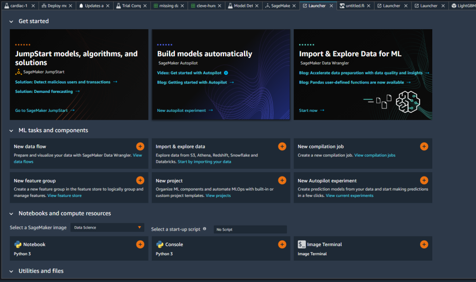
Following along with the procedures I had just learned five minutes earlier by reading a tutorial, I created a new data flow:
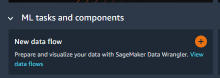
This launched a new Data Wrangler app in the EC2 cloud, and I could almost feel my compute budget draining. I then pointed Data Wrangler at my comma-separated value table, sucked it in, and began digesting. Hopefully, some magical data transform would make everything better.
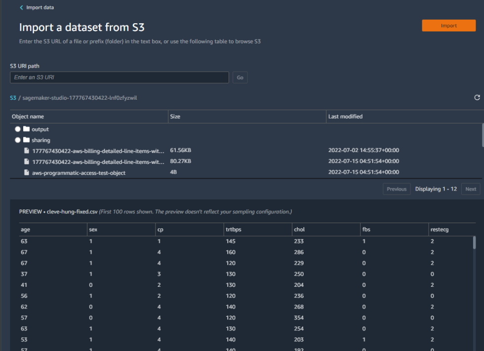
The first thing I did was look at how the data had been typed:
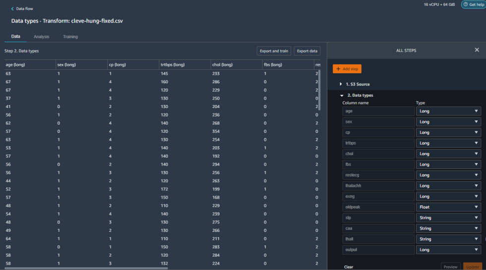
Everything was seen as long integer except for "slp," "caa," and "thall," which were read as strings. Why strings? Well, some of the cells were empty, so maybe they were being read as labels. There were also question marks in some of the cells (which I thought I had purged), which clearly meant I needed to do some more cleanup.
To see the extent of what I needed to do, I did a data quality analysis, which generated a pile of statistics about the table I had imported. This is downloadable, but only as a .PNG graphic file, which is not super helpful unless you're creating analysis reports out of screen grabs. But hey, better than nothing. (As a rule, SageMaker notebooks are generally not great at outputting data in a format you can do anything with other than show how pretty SageMaker is.)
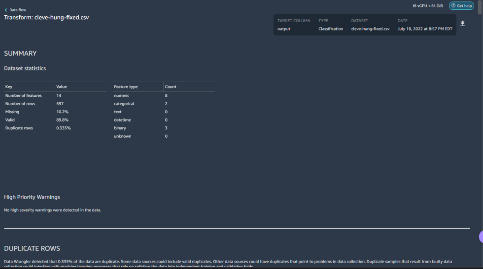
Here I learned some lessons. A little over 10 percent of my data was missing—the gap left by the Hungarian data for those two unfortunately important columns of data. I could either try to fill in those fields with something—like marking them as null—or I could look at the forecast and leave them be.
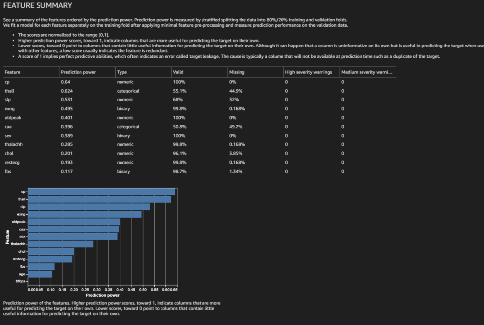
I decided to locate where exactly all the missing data was before I moved on. The SHAP values predicted here were different from those I got from the Canvas model. My analysis also showed that "thall" and "caa" were both very important and missing data in over 40 percent of their rows.
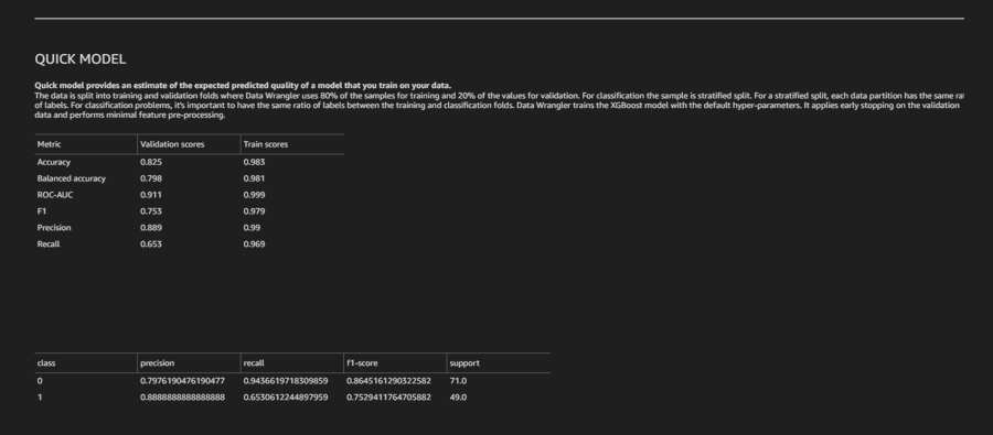
Also, a quick model analysis, which is a forecast of how well the model built from the data will do, was not super-optimistic. While extremely accurate for the training scores, the validation scores projected were worse than what the Canvas model delivered:
To get an exact count of the missing rows, I ran a single Python PANDAS command in a custom data transformation step:
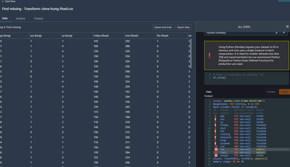
It turns out there were a few other places where data was missing. And I couldn't just drop the rows that were missing the data or I wouldn't have enough data to build the model. So the first time around, I tried dropping the worst columns entirely and just the rows with missing data for the other columns:
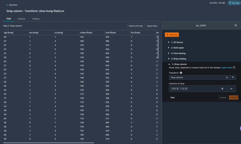
I then exported that data directly into a training job and hoped for improvements.
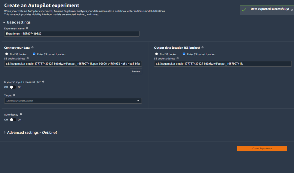
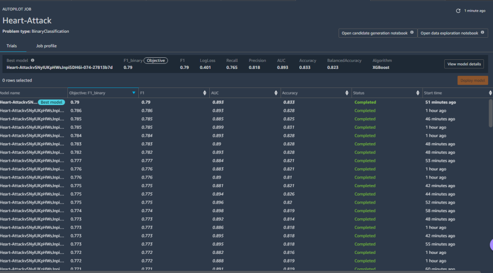
I did not get improvements. I got 83 percent accuracy and an F1 of 0.79. Worse.
This time for sure
So I went back to the data. I decided that if I could not fix the missing data, I'd just oversample the complete data. I dropped the rows missing "thall" and "caa."
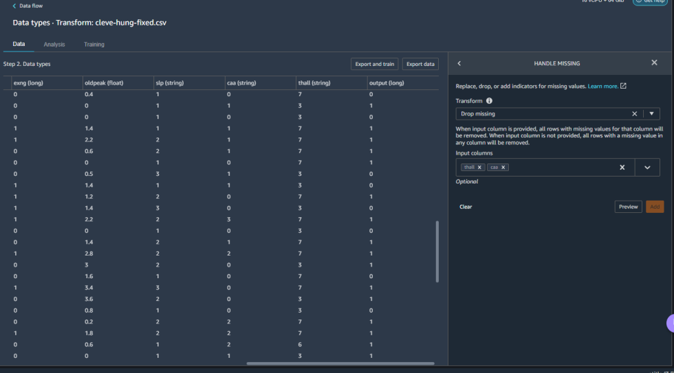
This time, I added a transformation to oversample the data to expand the set for the model, using random selection. And then I ran the modeling job with fingers crossed.
Two hours later, I had my results. They weren't great—but they weren't terrible, either.
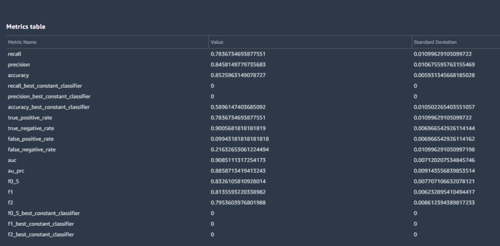
The data scrubbing and enhancement did get me some gains, but they did not match Canvas' previous performance. The overall accuracy was at 85 percent, with the true negative rate (guessing "no heart attack" correctly) at 90 percent. The F1 score went up to 0.81—still not something I'd bet life and death on but a lot more accurate than it had been. Recall was the real drag—0.78. The confusion matrix tells the story:
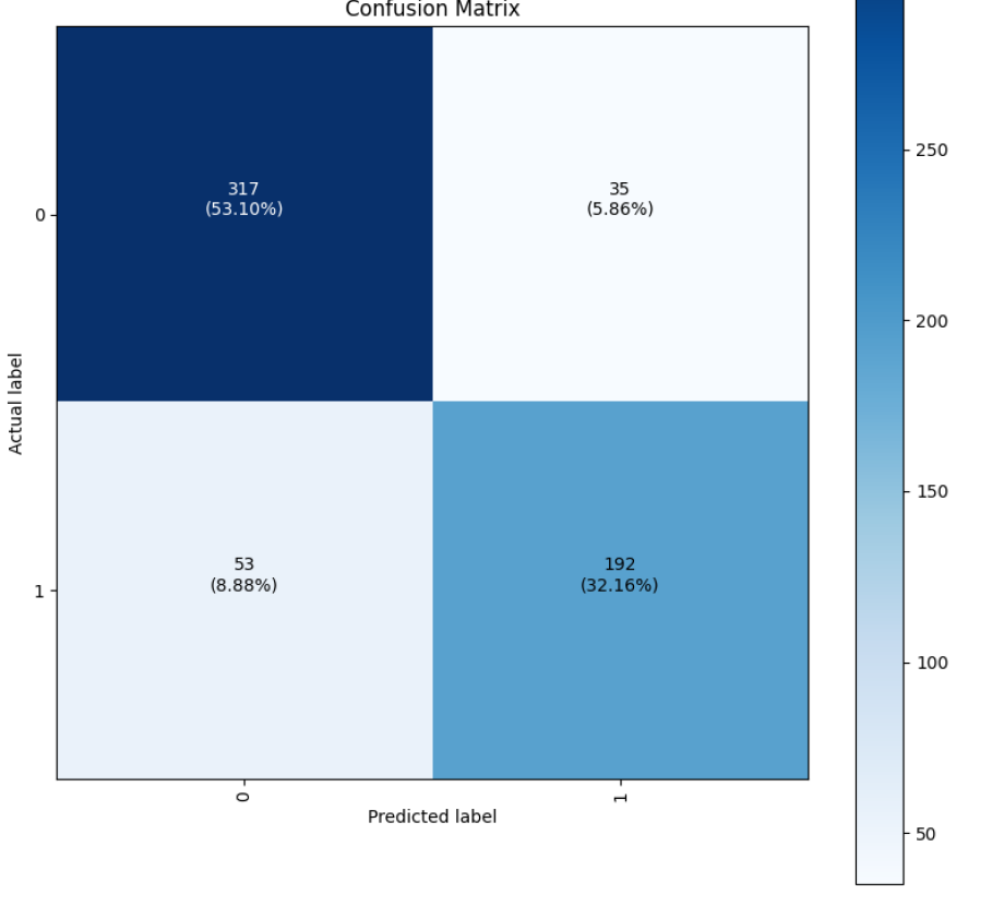
Still, a false negative rate of 8.9 percent is not horrible.
Measuring against the mythical (hu)man-month
There are obvious limits to how much I could do with the data available with these tools. The Canvas results were likely the best I could do with the data set with my limited experience in statistics and data analysis, the somewhat mediocre data quality, and the limits of the data itself. If I had complete cardiac measurement data for 1,000 patients, it would have been much easier to get an accurate model—that is, if there was one to be found in the data to begin with.
But then again, my effort with Data Wrangler and AutoML wasn't horrible. As I reviewed some of the notebooks of people who had claimed 90 percent accuracy with just the abbreviated, perfect data set, I realized that they had done some rounding up. While one example achieved a 90 percent accuracy with a linear regression model, the person did not calculate precision, recall, or F1. Most of the results, using a variety of models, were in the mid-80s for accuracy.
Considering all that, the Canvas run—which took about an hour and 45 minutes in total from data ingest to model—was a win over even the time I spent doing initial data analysis. And it turned in better results than the hand-coded efforts by all of the human data scientists who had used the data set (albeit with a little extra data). The "easy button" won over John Henry.
Clearly, there's a lot of magic going on behind the curtain with Canvas that is not being exposed. The data handling is all automated, so it's hard to tell what was done to improve its use of the data set with missing data and to produce its output. So as a tool for business analysts, it's great—but it certainly won't turn them into data scientists. And that's OK because business analysts and data scientists are different animals entirely, even if they're often solving similar problems.
Speaking to Ars, Amazon Web Services Senior Product Manager Danny Smith explained a non-obvious conundrum: Waiting for a data scientist to analyze one's data "is like waiting for an IT project," he said, noting that biz analyst customers have told him things like, "'We have to wait 18 months to just get to the front of the queue.' And then the data scientists, who are all scarce resources, they're like, 'Well, OK, what's the project's ROI?'"
Smith continued: "And the business analyst is like, 'If I knew that, I wouldn't need your help!... I've got this data, I've got a business problem. I've got questions for this data. I don't know what it's worth until we actually do the analysis.' So the business analyst is thinking about just accelerating to the point where they can actually argue for or justify their use of a scarce data scientist."
The Data Wrangler and AutoML approach was a less conclusive win. I could have probably done a better job with more experience and actual data science-ing skills. But even with some pre-canned data transformation methods, my ham-handed modeling efforts were in the middle of the pack in comparison to the pool of more schooled machine learning practitioners.
I declare victory for the machine-driven machine learning—at least in terms of reduced effort. The compute time I spent for the whole project came to about $1,000, and it took me approximately six hours of actual effort (including watching the wheels spin during model building) with the tools—the majority of that time in Studio in the second half. The Canvas portion, which blew through about $300 of compute on my two attempted models, only took about two hours, including model build time.
In comparison, I estimated human effort requirements for the project to be between one and three person-days, depending on the platform used and the skill of the data scientist. But I wouldn't say that these tools replace the need for data scientists by any stretch of the imagination. If anything, they're useful for hammering out quick models for assessing the more workaday analytic problems facing an organization.
I'm not so sure about trusting them to predict heart attacks, though.
Machine learning, concluded: Did the “no-code” tools beat manual analysis? - Ars Technica
Read More
No comments:
Post a Comment